BIBA and the Art Deco Revival
BIBA & the Art Deco Revival
Inspiration capsule featuring the work of Hilary Jane & Barbara Hulanicki’s London brand and department store BIBA.
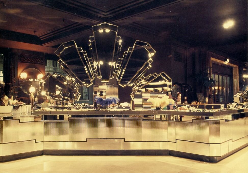
I’ve been developing my artistic style based on inspiration from the 1960’s & 1970’s for many years now, and it’s by far my FAVOURITE. Throughout my childhood I was always captivated by the beauty and allure of late mid-century design, specifically anything that catches the eye with a reflection; a sparkle highlighted off a brass element on a glass coffee table or a lucite candleholder, or the frames of gold veined and smoked mirrors, echoing infinite dimensions in a hotel lobby, lush with interior gardens… and the velvets, let’s not forget the velvets!
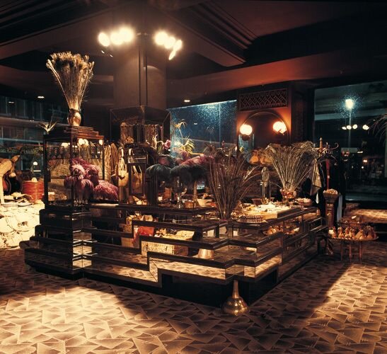
The stoic edges of glass and brass and high vaulted ceilings and archways that I love so much pave the way to creating a space that it rich, luxurious and just EXTRA
EXTRA = a word for never enough
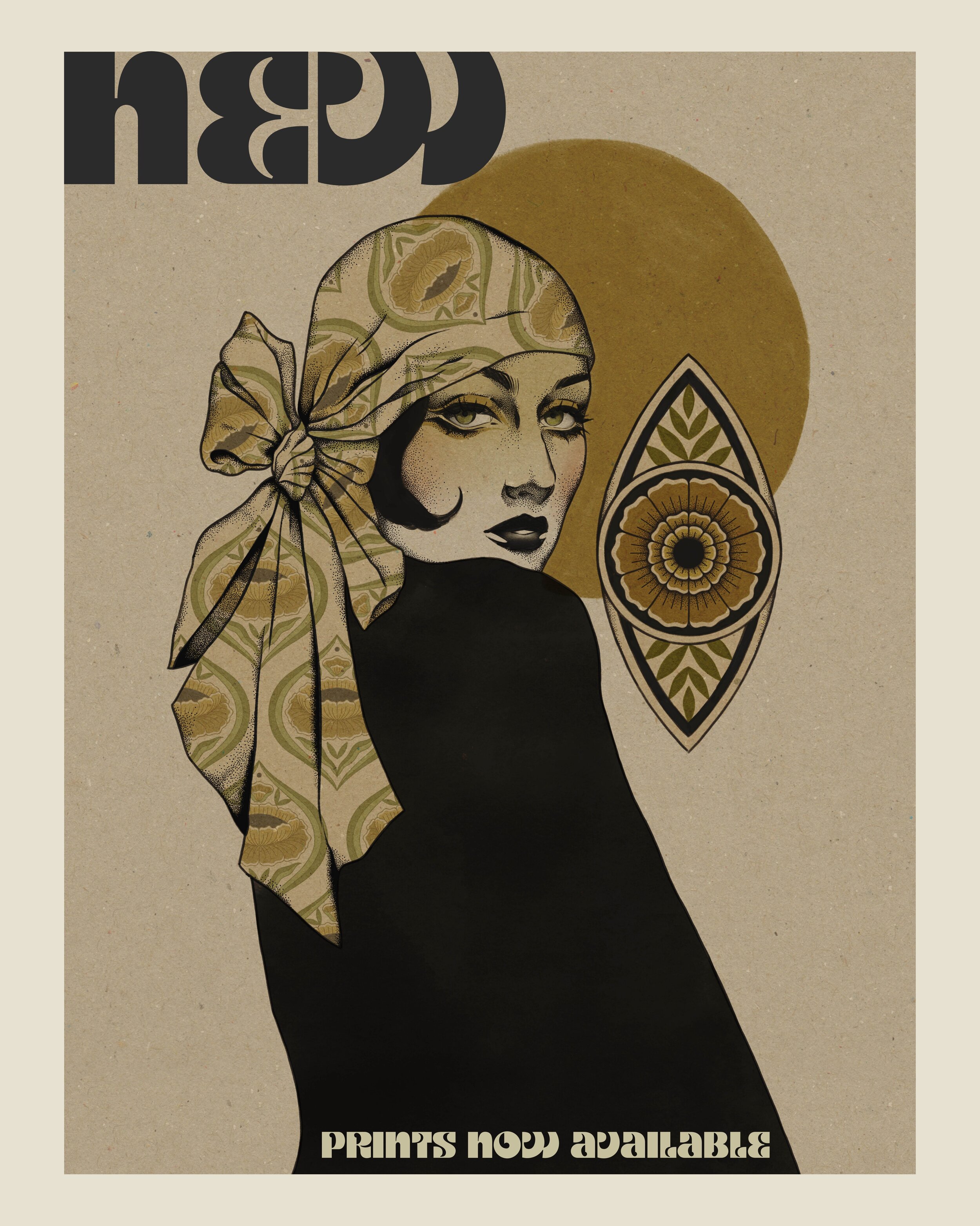
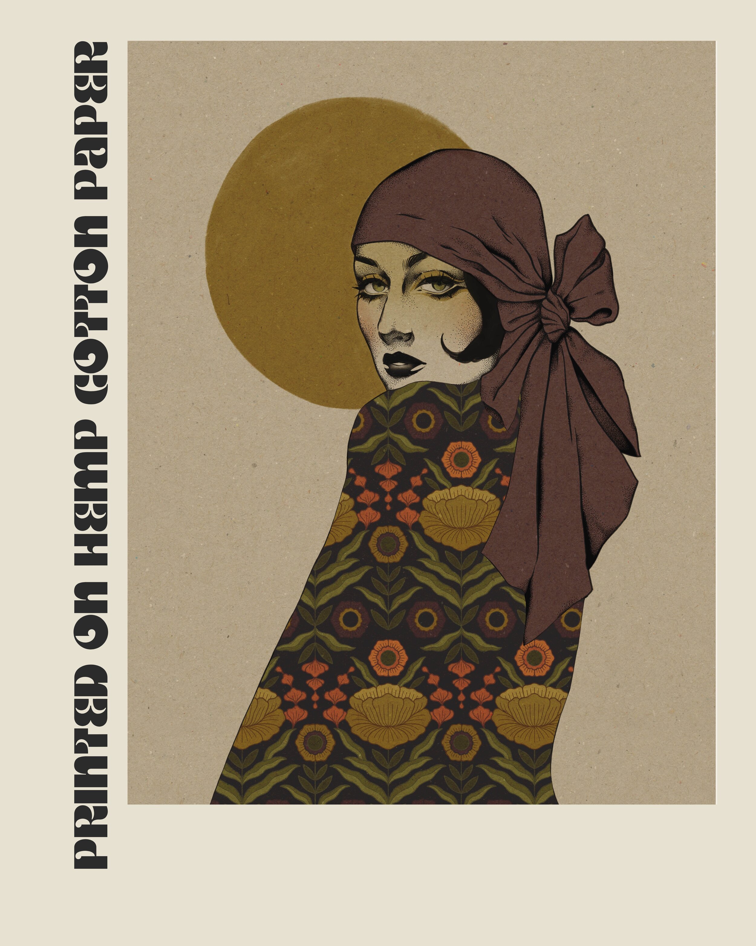
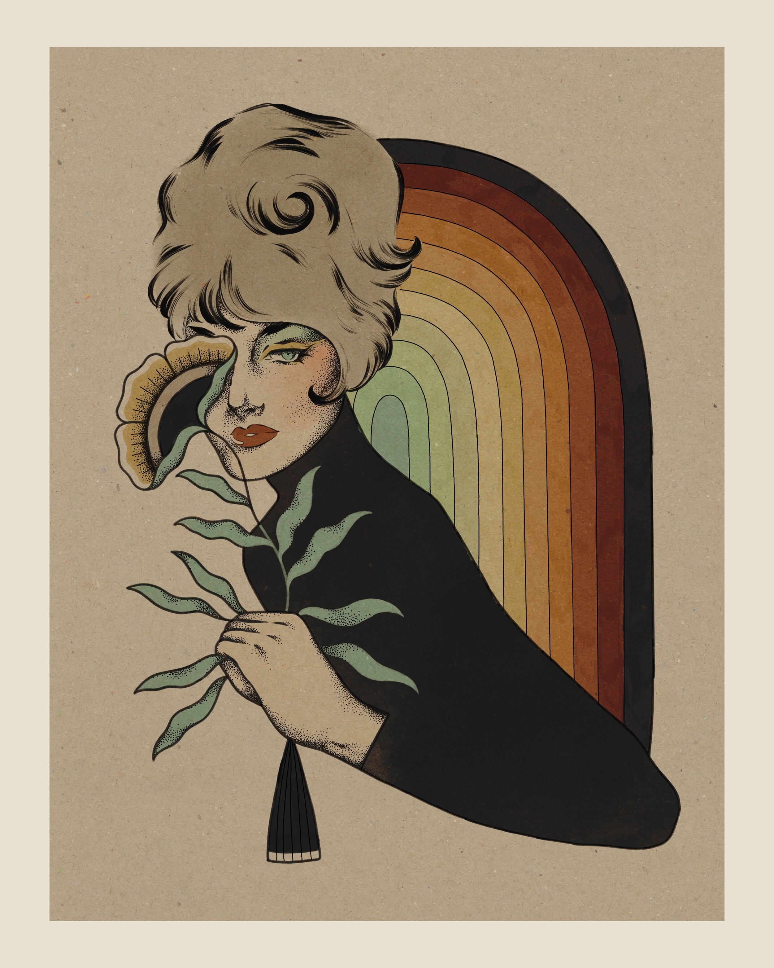
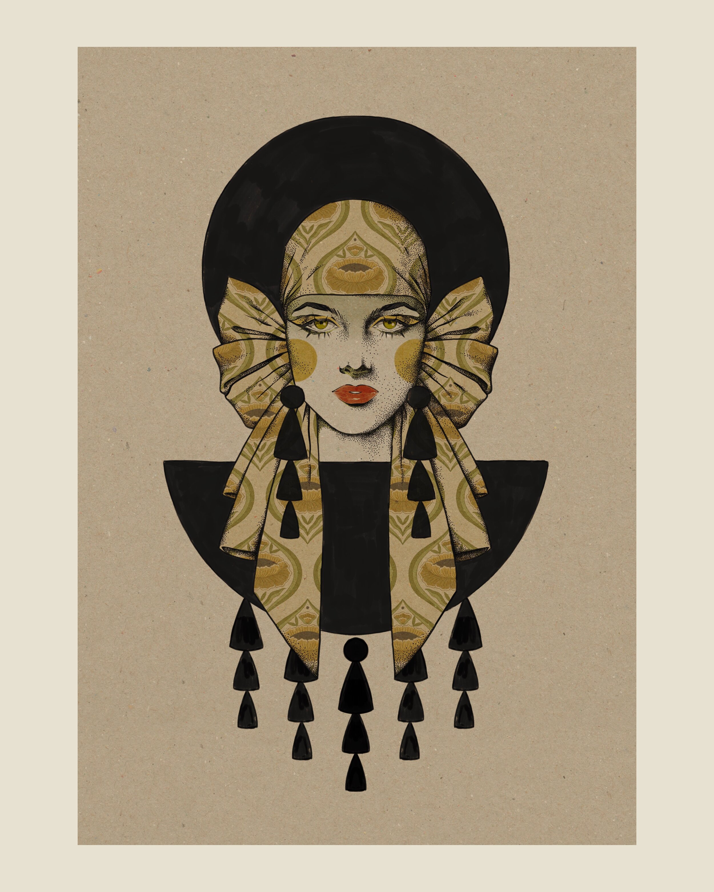
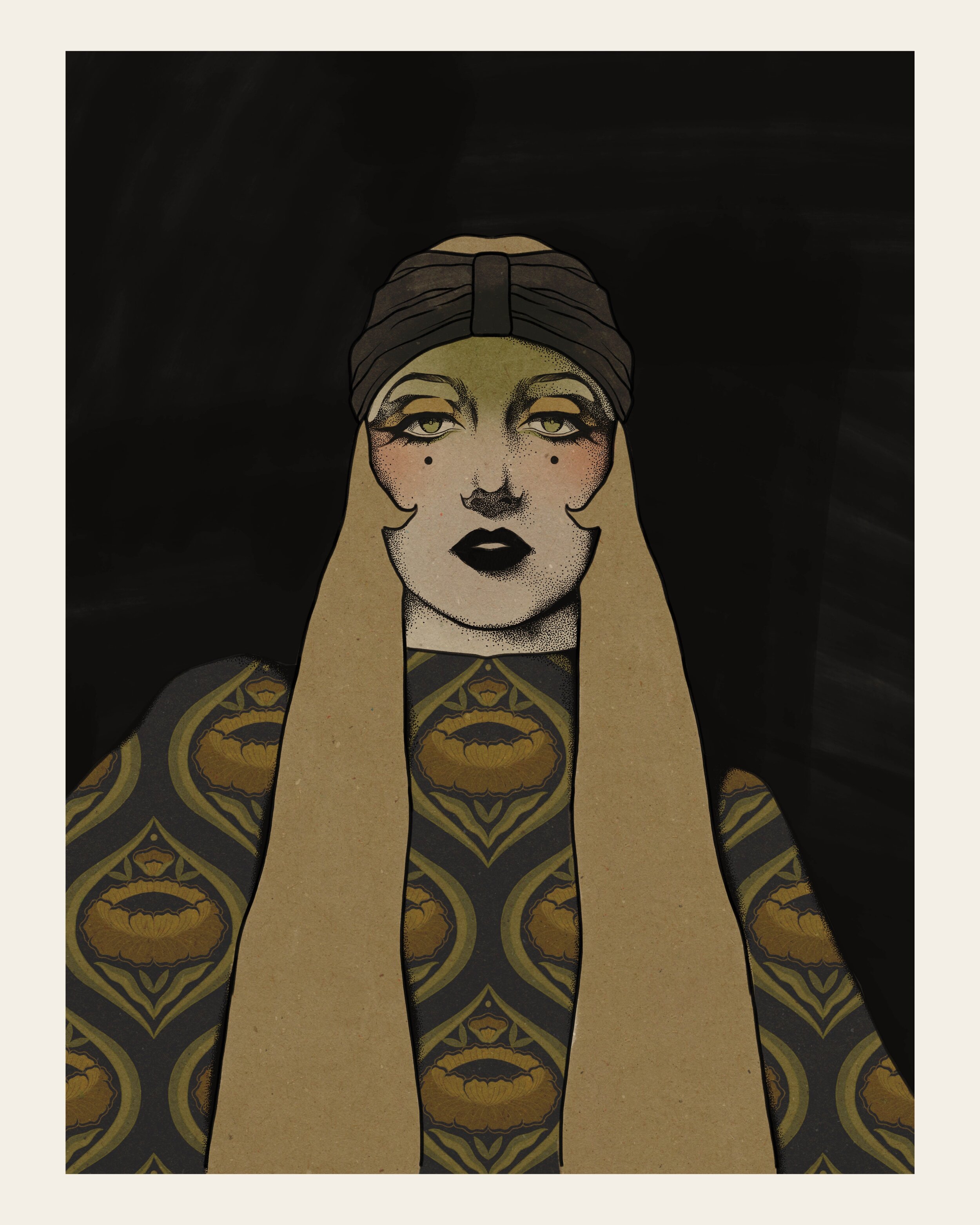
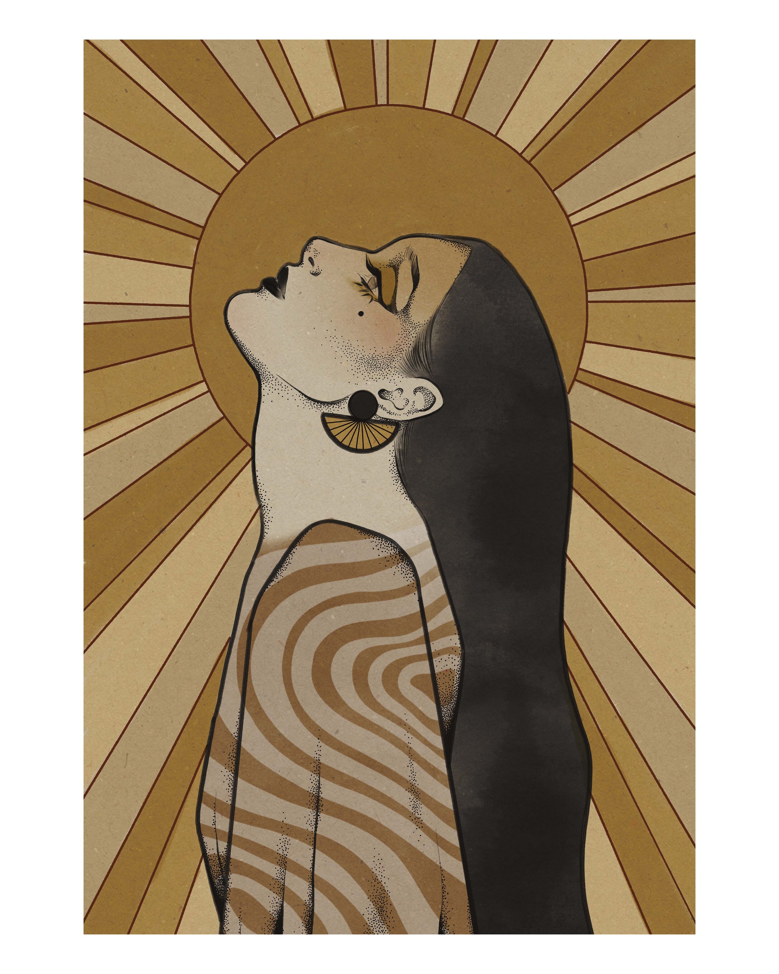
I’ve always leaned towards the organic and groovy shapes of the 1960’s and have based a lot of my work on this essence, however, with the discovery of more architectural and contrasting design from this era, such as London’s lost BIBA, I’m bringing my work and design to another level based on inspiration alone. My new collection of art prints and photography is precisely inspired by this niche aesthetic.
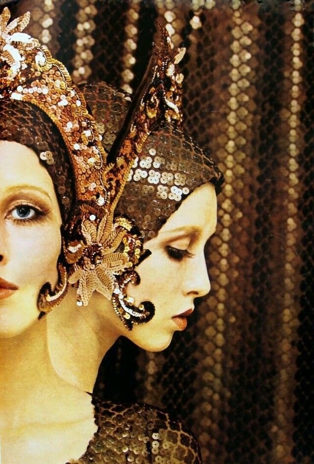
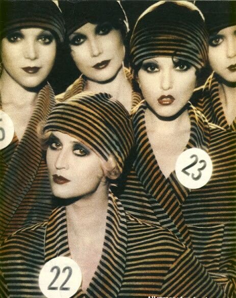
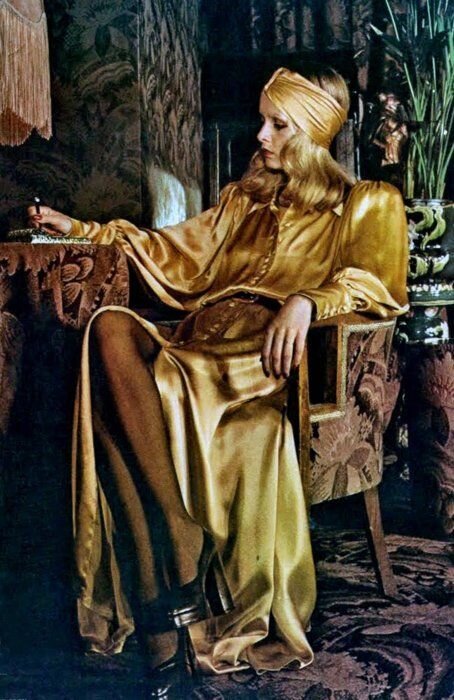
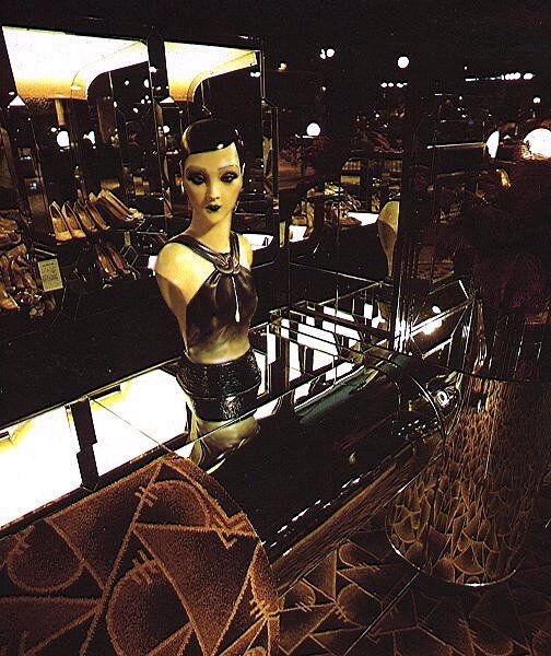
silk headscarves, dark droopy eyeshadow, rich velvety motifs and golden glamour.
this is what I am talking about, and you can find these prints for sale here.
BIG BIBA was a department store created by Poland born Barbara Hulanicki, who basically set the tone to an entire fashion era, an absolute icon in the fashion industry.
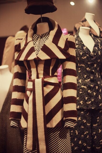
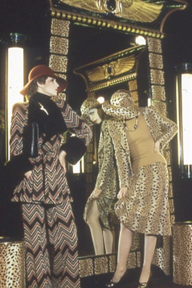
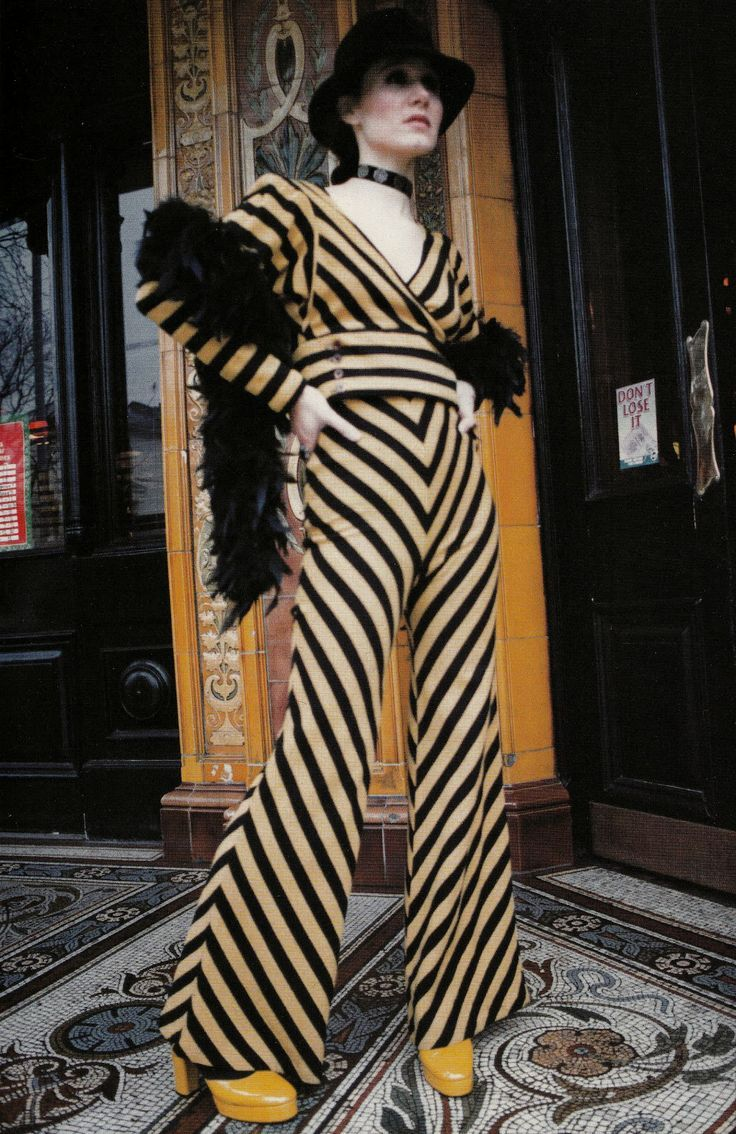
Supported by a fond love for art deco, she managed to create some perfect mix between the 1920’s sultry black-haired vamp and up to date groovy (but dark) motifs and mod girls sporting gigantic shades and scarves in the -now- style of PUCCI.
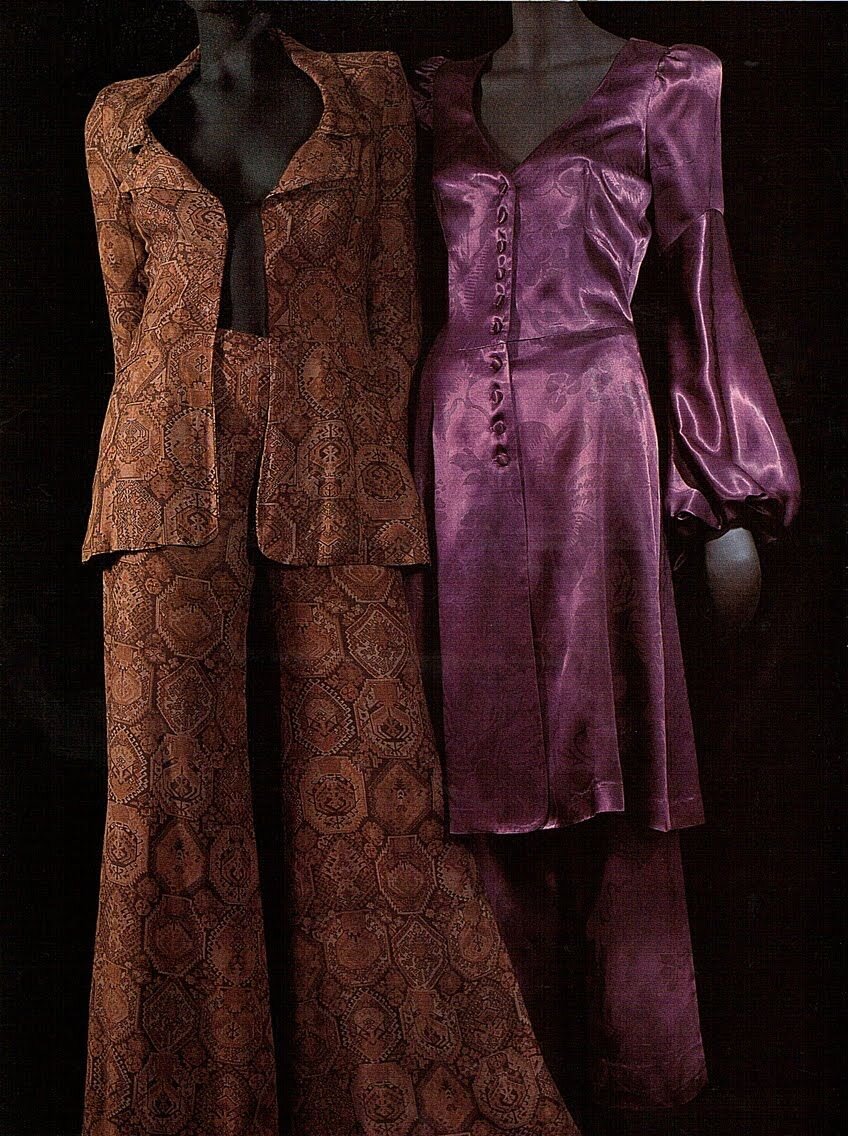
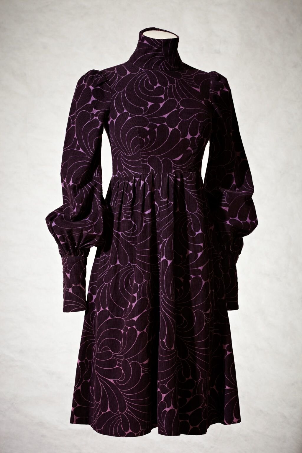
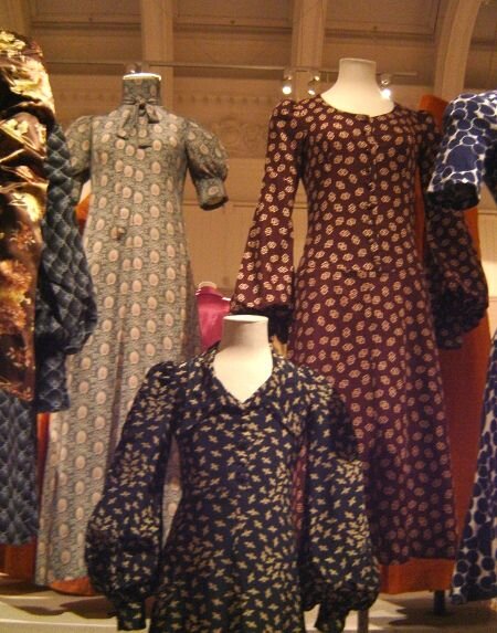
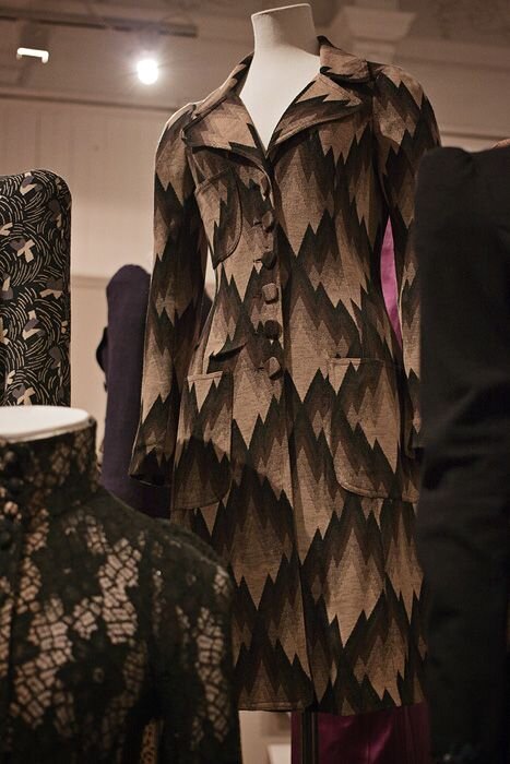
The styles were buzzing with eclectic patterns in plums and burgundies, made of silks and leopard print.
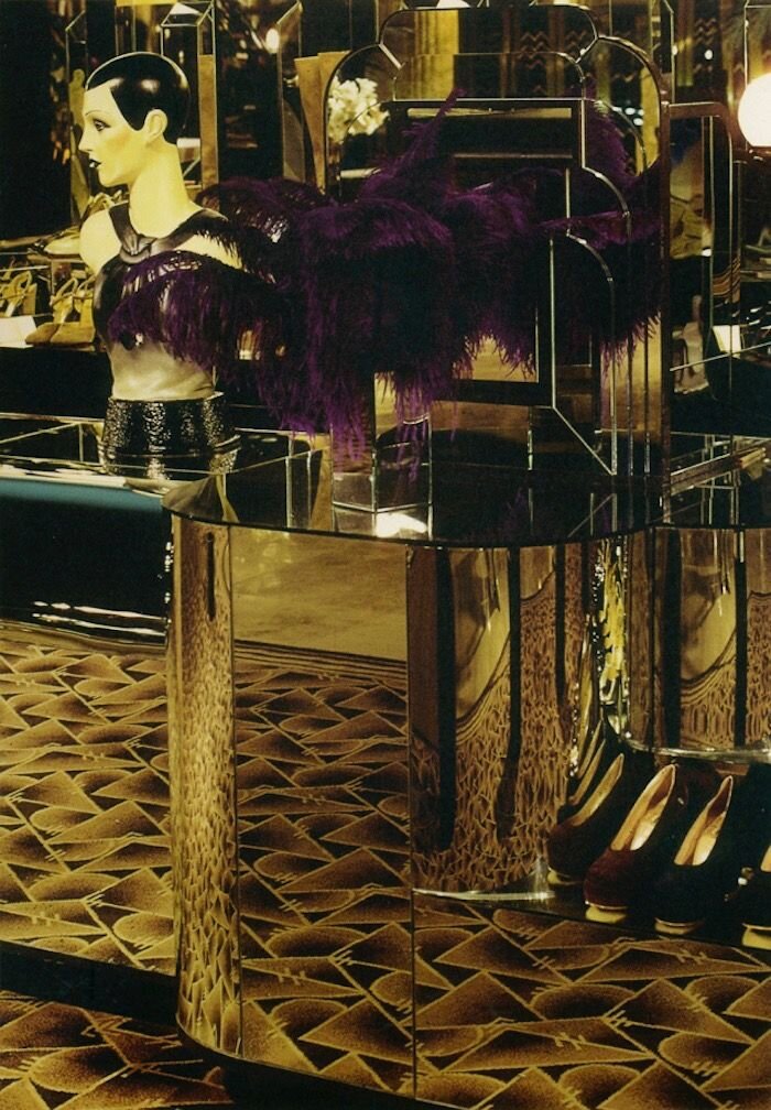
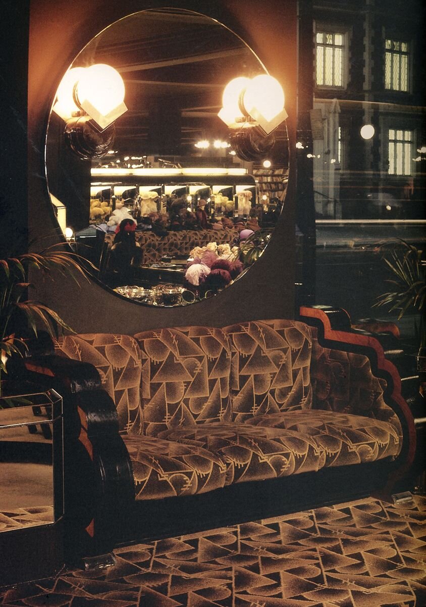
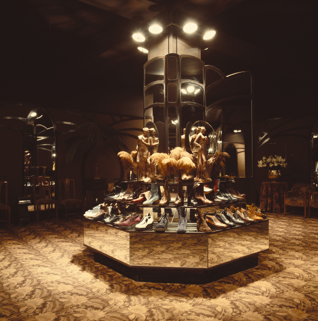
However, the design of the actual store is where we’re getting at.
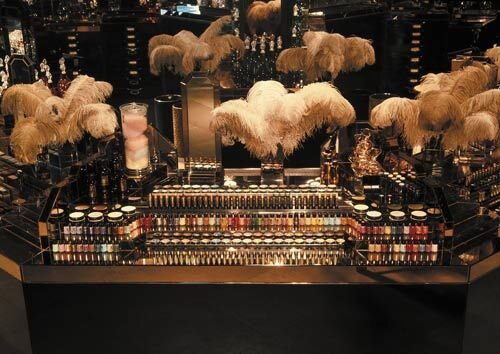
It was EXTRA black lacquer, EXTRA gold, and EXTRA leopard print, somewhat a paradise for high society cigar smoking vamps looking to spend an afternoon having a shopping experience such as walking through a circus funhouse.
it was for everyone, but I always like to imagine the perfect scenario…
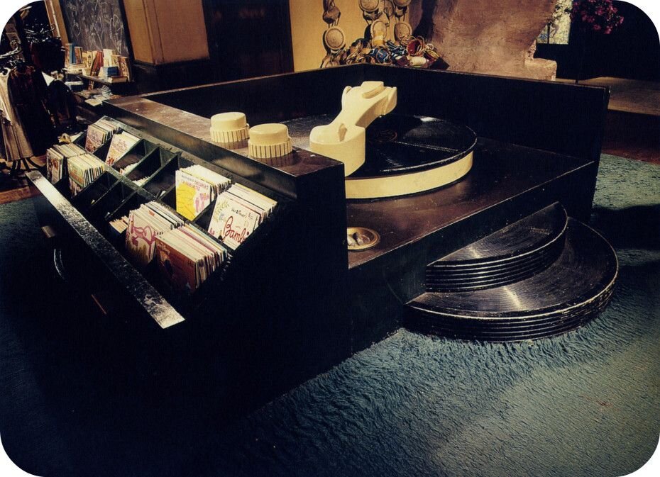
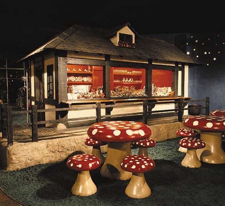
One section of the store had seating that was shaped like giant red and white mushrooms, not to mention other giant elements, such as a 10-foot-wide record player. Another section displayed a gigantic dog where you could buy dog food right from its belly.
um yes….
As I obsessively look over pictures of this place (like why the hell doesn’t somewhere like this exist anymore???), it just pushes me in the direction of continuing to find my own unique style in home design, such as Barbara did, and maybe one day open a store as brilliant as this one. For now, I’m just going to keep doing this to my own personal space, and share the splendour with you over time.
Follow me on IG @hilaryjanehome and Pinterest HERE for the good stuff.
written by Hilary Jane
Artist, designer and photographer for Hilary Jane Home.
xx
