Viewing a room as one entity
You know the moment, you’ve experienced it whether you’re scrolling through social media, scouring the shelves of an antique store, or browsing the website of one of your favorite artists – you see a piece of art and know that for whatever reason you need it in your space. That’s part of the powerful magic to art, that sometimes you can have no idea why it resonates so deeply or why its imagery is so impactful, but it elicits such a response that you want to experience it over and over again. But the complication may occur when it comes to placing or styling such a significant or bold piece of art in your home.
Naturally there’s several paths to styling artwork in your home. Perhaps you choose to use it as the focal point, building out a space around the theme and colours of this particular artwork. But if you’re well-established and content with the existing aesthetics of your home, it may seem difficult to introduce a style with different patterns, colours, or themes. And then of course you can always throw out the home styling handbook, and mix and match styles and textures and colour palettes all you want to create a vibrantly disorderly you-ness. There’s no right and wrong when it comes to creating your personal haven.
At Hilary Jane Home, whether it comes to designing a seasonal collection, creating a moodboard with new products, or even styling our personal homes, we like to view a space (whether that be room-by-room or a collective home) as a singular entity. And while that doesn’t insist on all artworks having the same theme or every piece of furniture being of a particular era, it has more to do with establishing a cohesive, palpable feeling in a space.
Whether you’ve just moved into a new home or you’re looking to refresh your existing space, start by considering, ‘what is the vibe I want for this space? What are the feelings or moods I wish to elicit from this space?’ Similarly, when it comes to selecting and styling a bold or large scale artwork, you can contemplate, ‘what does this art piece evoke in me? What am I reminded of? What kind of mood does this artwork put me in?’ Reflecting on that initial impression will help you first decide which space in your life this artwork belongs in (i.e. your bedroom, office, living room, etc.), and subsequently will help you seek out a comparable feeling when you’re selecting the rest of the pieces for this room.
So how did one tapestry take us on this journey? We began by examining the prominent colours of cool sage green, golden, and sandy grey-brown, extracting those, and creating a gradient of complementary tones and hues that evoke a relaxing, calming environment. The central tiger image inspired an Asian node in the aesthetic, as seen in the paper lantern and fan decor. We want to utilize our aforementioned principles of design – balance, contrast, proportion, harmony – to mix in delicate floral patterns and textural greenery. Highlighting the golden tone from the tapestry, we brought in some 1970’s-inspired bouclé texture in the cloth furnishings in a similar hue. Grey sea-greens, rustic cedar woods, and muted earth tones are reminiscent of the laid-back, oceanfront vibes we’re looking to evoke in this room.
For this article, we chose to select our new Yora Tranca tiger tapestry, in both the black and cream colourway, as the bold artwork with which to center our room’s vibe and aesthetic. These new, extra-large tapestries can be styled numerous ways, whether as part of a busy gallery wall or as a stand-alone statement piece. And depending on the furniture and decor you choose to place it alongside, it can evoke very different moods and sentiments. Exploring our first moodboard with the cream Yora Tranca tapestry, we’re transported to the grey, misty skies of Northern California, where the salt-laden air and white-capped waves crash together onto the chilled sandbanks. You return to your cedar shake seaside cottage, hair damp from a morning surfing eager to warm yourself from the brisk weather. Your time is your own and you meander into the sitting room with a steaming cup of tea and a novel, ready to relax and lose track of the day.
Yellowstone pools by shessobright - living room by Electric Bowery - yellow print block fabric by Walter G Pahari - bouclé armchair by Le Lièvre Paris - lantern by Doris Vintage
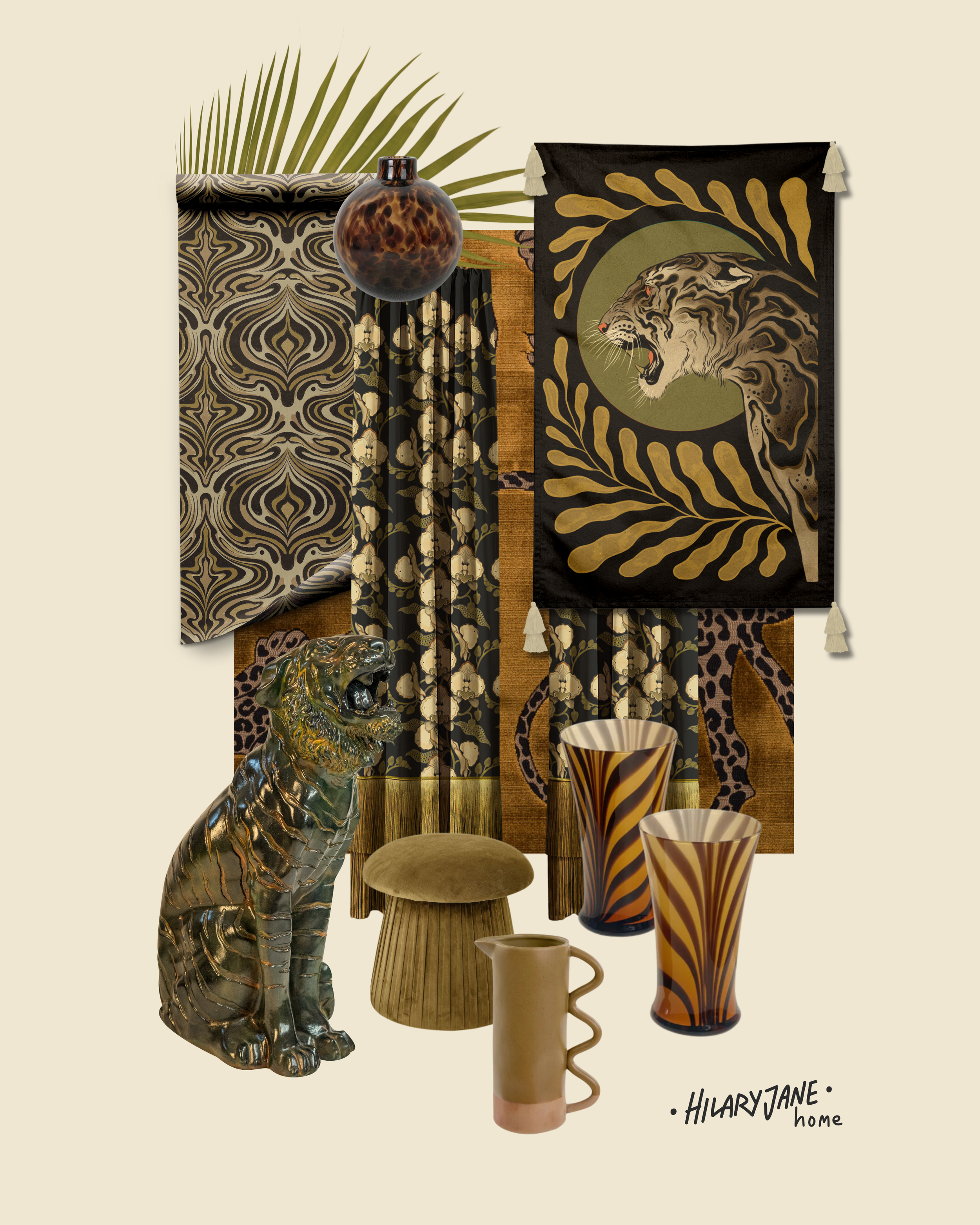
But when we turn our attention to the Yora Tranca tapestry in black, we see a much different scene. From this moodboard simply close your eyes and perhaps you can get the faintest whiff of burning sandalwood and jasmine incense. You find yourself in a dark and moody sitting room akin to an opium den, where the walls and windows are draped in luscious crushed velvets and you lean back against silk embroidered pillows. In this maximalist space the spiraling smoke clouds compliment the various animal prints and patterns in the linens and the wallpaper, so much so that who’s to say where one fabric ends and the next begins.
curtains, wallpaper & tapestry by Hilary Jane Home - stool by Trit House - caramel fabric by Catherine Martin Design
So how is it that changing the background colour and a few hues of the tapestry could create such a distinctly different space in both aesthetic and emotion? Well in creating this moodboard we leaned heavily into the various textures of patterns found in both the tiger and background of the tapestry, and utilized comparable patterns like tortoiseshell, stripes, animal print, palm fronds, and florals in a curated colour palette. When selecting linens and furnishing, the incorporation of various tactile fabrics like velvet, silk, and embroidery creates a decadent, maximalist look that allows for some more creative freedom when it comes to mixing patterns.
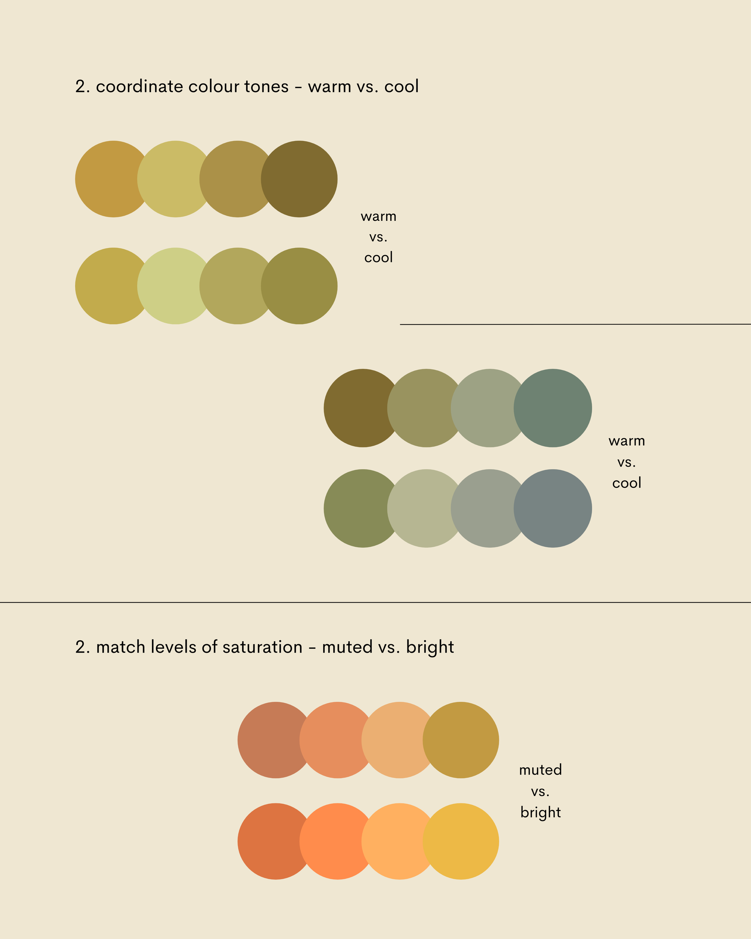
But the key to keeping the maximalist vibe feeling cohesive rather than chaotic is in creating a harmonious colour palette. To do so, examine whether you’re using primarily warm or cool tones, and whether they are saturated to be bright and bold, or muted and subtle. Creating these colour families will assist you in making selections that add an intentionality to the maximalism, rather than just adding more.
It’s certainly not easy to know where to begin when you go to transform a space, no matter how big or small. The abundance of selections, even when it just comes to art, can be overwhelming and sometimes you may find yourself with an assortment of items and artworks that don’t have anything in common other than, ‘I like them.’ So before you go into a buying frenzy and end up with a bunch of mismatched puzzle pieces, perhaps try changing your initial question from, ‘what do I like?’ to ‘what do I want to feel?’ Once you can identity what mood you want from your space, you can set up about sourcing the artwork, furnishings, decor, and colours that bring you back to that mindset.
By Brie Roche-Liliott & Hilary Jane


